How Colors Impact Print Design and Marketing
Colors play a powerful psychological and emotional role in print design and marketing. Whether it’s a business card, brochure, flyer, packaging, or billboard, the colors you choose directly influence brand perception, customer emotions, readability, and buying decisions.
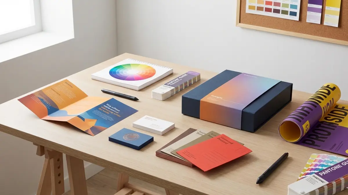
This guide explains how colors affect print marketing, how to choose the right color combinations, and how businesses can use color strategically to improve results.
Why Color Matters in Print Design
Color is often the first thing people notice in printed materials. Studies show that people form an opinion about a brand within seconds, and color heavily influences that first impression.
Key Reasons Color Is Important
- Creates emotional connection
- Builds brand recognition
- Guides reader attention
- Improves readability
- Influences purchase decisions
In print marketing, the right colors can increase engagement, while poor color choices can make designs look unprofessional or confusing.
Psychology of Colors in Marketing
Different colors trigger different emotions and reactions. Understanding color psychology helps businesses communicate the right message through print.
Red – Energy & Urgency
- Creates excitement and attention
- Commonly used for sales, discounts, and promotions
- Works well for call-to-action elements
Best for: Food brands, retail offers, clearance flyers
Blue – Trust & Professionalism
- Represents reliability and calmness
- Builds trust and confidence
- Very popular in corporate branding
Best for: Corporate brochures, healthcare, finance, technology brands
Green – Nature & Growth
- Associated with health, sustainability, and balance
- Creates a calming and positive feel
Best for: Eco-friendly brands, recycling businesses, wellness companies
Yellow – Optimism & Attention
- Bright and cheerful
- Grabs attention quickly
- Should be used carefully to avoid eye strain
Best for: Promotional flyers, event posters, children-focused brands
Black – Luxury & Authority
- Represents elegance and sophistication
- Adds a premium feel to print designs
Best for: Luxury packaging, fashion brands, high-end business cards
White – Simplicity & Clarity
- Creates clean and minimal designs
- Improves readability and balance
Best for: Modern branding, professional layouts, minimalist designs
How Colors Influence Buying Decisions
Color doesn’t just look good — it directly affects consumer behavior.
Impact on Customer Decisions
- Encourages emotional responses
- Builds trust before reading text
- Makes brands more memorable
- Influences perception of quality
In print marketing, strong color choices can increase response rates and improve overall campaign performance.
Choosing the Right Colors for Print Materials
Not every color works for every brand. The goal is to match colors with your brand identity, audience, and marketing purpose.
Understand Your Target Audience
- Age group
- Cultural preferences
- Industry expectations
For example, corporate clients prefer calm, professional colors, while youth-focused brands benefit from bold and vibrant tones.
Match Colors with Brand Identity
Your print colors should align with:
- Logo colors
- Brand personality
- Existing marketing materials
Consistency across brochures, banners, and packaging strengthens brand recognition.
Color Combinations That Work in Print
Choosing the right combination is just as important as choosing individual colors.
Best Practices for Color Pairing
- Use high contrast for readability
- Avoid using too many colors
- Keep background and text colors clearly separated
- Test colors in print, not just on screen
Some colors look different when printed, so always check print samples before final production.
Print vs Digital Colors: What You Should Know
Colors behave differently in print than on screens.
CMYK vs RGB
- RGB is used for digital screens
- CMYK is used for printing
Designs created in RGB may look different when printed. Always design print materials in CMYK mode to ensure color accuracy.
Common Color Mistakes in Print Design
Avoiding common mistakes can save money and protect brand image.
Mistakes to Avoid
- Using low-contrast text and background
- Overusing bright or neon colors
- Ignoring cultural color meanings
- Not testing printed samples
- Mixing too many colors in one design
Simple, balanced designs usually perform better than overly complex ones.
How Color Improves Brand Recognition
Consistent use of colors helps customers recognize your brand instantly.
Benefits of Color Consistency
- Builds trust
- Makes marketing materials recognizable
- Strengthens brand identity
- Improves recall
Brands that use consistent colors across all printed materials appear more professional and reliable.
Conclusion
Color is not just a design element — it is a strategic marketing tool. In print design, the right color choices can enhance brand perception, influence emotions, and drive customer action.
By understanding color psychology, maintaining brand consistency, and choosing print-friendly color combinations, businesses can create high-impact print marketing materials that stand out and convert.
Frequently Asked Questions (FAQs)
Which color is best for print marketing
There is no single best color. The ideal choice depends on your brand, audience, and marketing goal.
Do colors look different in print than on screen
Yes, printed colors often look different. Always design in CMYK and test samples.
Can color affect sales
Yes, color strongly influences emotions and buying decisions, especially in print advertising.
How many colors should I use in print design
Usually 2–4 colors work best for clean and professional results.
Is black-and-white printing effective
Yes, when designed well, black-and-white prints can look elegant and professional.